Teaching Classroom Lessons New Mexico Book List News Media and More Youth Activism Films Podcasts
“The more we can engage people in the specifics – the humanity of it all and the science – in ways that are relatable and concrete, the more successful we will be in shifting the discourse from apathy to change.” Photographer Nichole Sobecki

Climate Impact Lab is an excellent resource for middle and high school students to dig into the research and visual mapping on climate change. It has maps of the United States and the rest of the world, and students can see historical temperatures, current, and projected temperatures. It can help students visualize what areas of the world will be most impacted by changes in temperature.
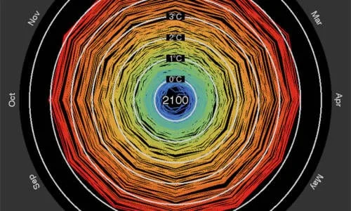 Climate Spirals
The Climate Spirals project is aimed at the challenge of effectively communicating climate change. Their animated climate spiral is a different way to show the historically observed changes to resonate with a broad audience.
 Climate Visuals
Climate Visuals contains a growing library of photographs to provide inspiration and guidance for campaigners, picture editors, and communications practitioners selecting imagery for communicating climate change. All images are captioned with an explanation of how they fit with the seven Climate Visuals principles.
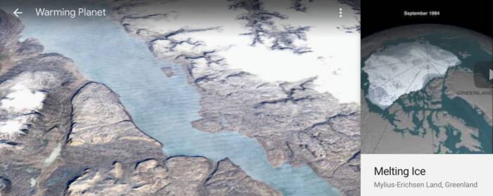
Google Earth Timelapse
Watch the effects of climate change with time-lapse photography in Google Earth’s Warming Planet Series. This beautiful and effective visual of climate change happening before your eyes is appropriate for middle through high school students.
 How Much Hotter Is Your Hometown?
How much hotter is your hometown? is an excellent interactive graphic that tracks how much hotter the planet has been getting recently. It really hits home, because students can search for their own hometown and see how even in their lifetime big changes have taken place. Perfect for 3rd graders and up.
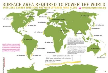
Land Art Generator Infographics
Land Art Generator’s infographics help explain facts about energy production and consumption and point the way to a viable solution to powering a post-carbon world. These could be very useful in advanced middle school and high school classrooms.
MIT Climate Science, Risk, and Solutions
This site summarizes the most important lines of evidence for human-caused climate change in a visually appealing way. It addresses uncertainty in our projections, risk and risk management, and options for taking action. This site can help students prepare for more effective conversations values, trade-offs, politics, and actions.
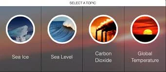 NASA Climate Time Machine

The NASA Interactive Time Machine is a resource for students to visualize how sea levels, sea ice, carbon dioxide, and global temperatures are changing over time.
The Global Ice Viewer allows students to choose a topic to see how climate change has affected glaciers, sea ice, and continental ice sheets worldwide.
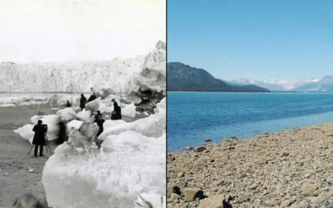
NASA Images of Change
This NASA Image Gallery features images of different locations, showing change over time periods ranging from centuries to days. Some of these effects are related to climate change, some are not. Some document the effects of urbanization, or the ravage of natural hazards such as fires and floods. All show our planet in a state of flux.
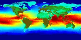
NASA Visualizing Temperatures
The NASA Visualizing Temperatures site is assembled from publicly available data acquired by about 6,300 meteorological stations around the world, ship- and buoy-based instruments measuring sea surface temperature, and Antarctic research stations.
The Solutions Project Renewable Energy Interactive
Click on the interactive map to envision how to get clean energy all over the world and where you live with digital infographic posters. The infographics include a wealth of information, including the number of jobs and improved health effects. These graphics are appropriate for middle through high school.
 States At Risk
States at Risk is a project aimed at showing how Americans in all 50 states are experiencing the impacts of climate change. The project focuses on five threats — extreme heat, drought, wildfires, coastal flooding and inland flooding — and the states most affected by these threats.

Understanding Climate Change
Trying to understand the cause and effects links of climate change in the context of the carbon cycle, water cycle and all the other processes that are part of Earth’s complex and dynamic systems is daunting. This site will help. Using icons like air temperature or snow and ice cover, students can even piece together their own model. It will help your students think about their place in the world – what affects their lives, how they influence other parts of Earth, and how they can solve local and global climate and environmental problems. The site includes associated lesson plans for HS and college.
Maps
 Oil and Gas Threat Map
This is a comprehensive data map showing the location of all active oil & gas wells in the United States (except North Carolina and Idaho), then counts the people, schools, and hospitals that live within ½ mile of these facilities. On national, state-by-state, and county-by-county levels it indicates the contribution of oil and gas air pollution to elevated ozone smog levels, and consequent asthma and other respiratory impacts. Using EPA data & models, it shows which counties have health risks because of oil & gas toxic air pollution.
It was created to show the public and lawmakers that this type of air pollution is a ubiquitous health threat that should be addressed with strong government standards. And that eliminating existing methane standards comes at the expense of the health and air that governments are obliged to protect.
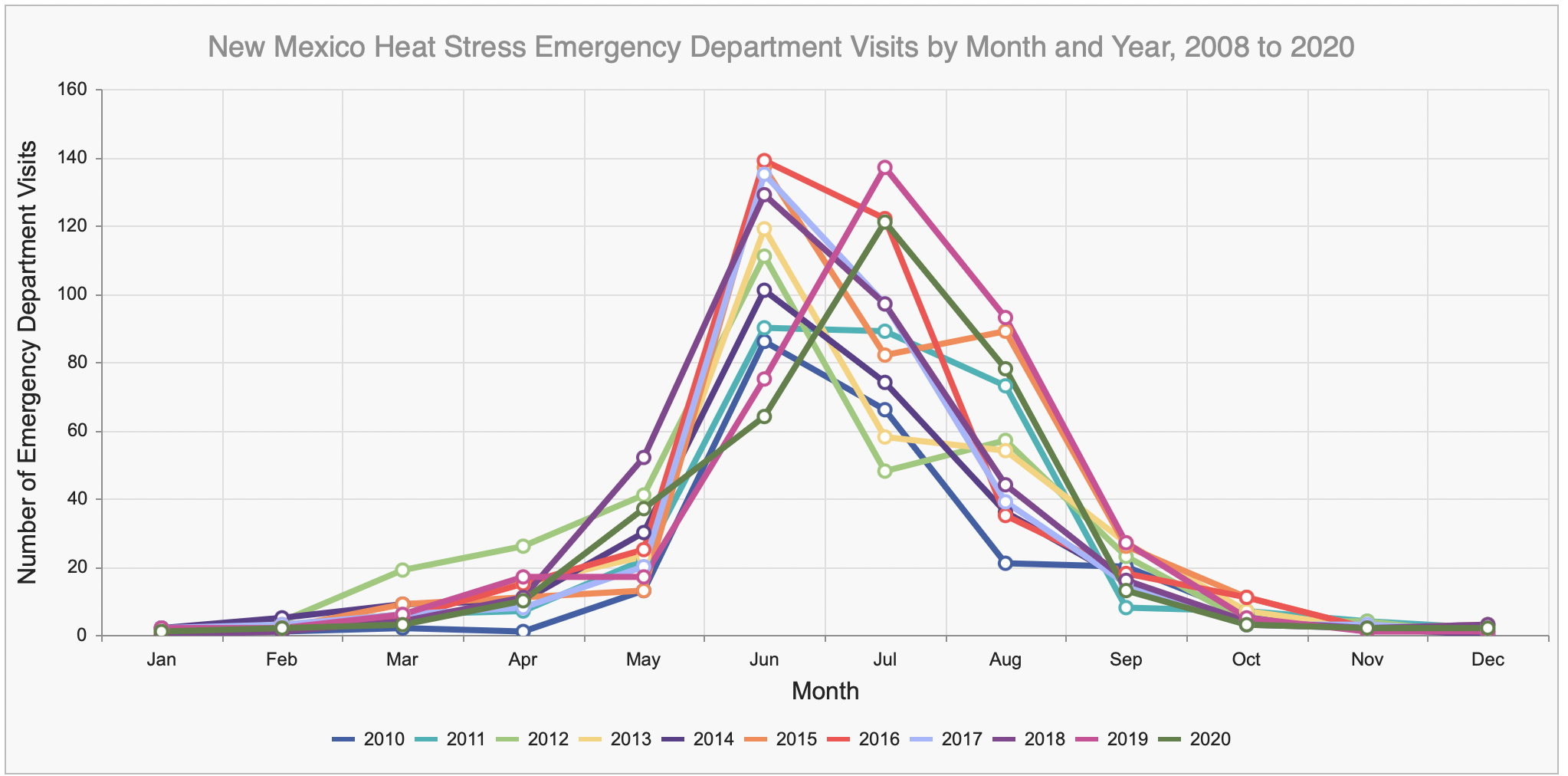
 CDC Heat & Health Tracker
Extreme heat events have long threatened public health in the United States. The CDC Heat & Health Tracker provides local heat and health information so communities can better prepare for and respond to extreme heat events. The map shows the rate of emergency department (ED) visits associated with heat-related illness (HRI) per 100,000 ED visits by region. Community characteristics, social vulnerability, temperature, emission, air quality, and a variety of other relevant data can be finely explored at the CDC’s National Environmental Public Health Tracking Network.
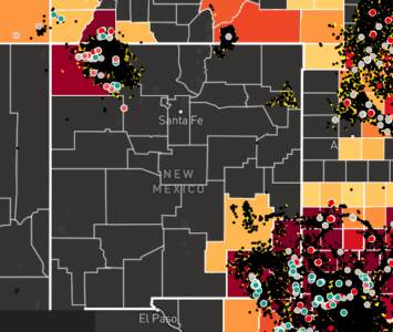
NM Environmental Public Health Tracker
The New Mexico Department of Environmental Public Health provides public databases for heat stress, asthma, cancer incidence and other health indicators as well as air quality (eg ozone, PM2.5), water quality (radium, uranium, arsenic & other concentrations), temperature and precipitation at the county level.
Using Videos and GIFs to Visualize
A comparison of atmospheric carbon dioxide concentrations and temperature variations
Temperature anomalies arranged by country from 1900 – 2016
https://youtu.be/K4Ra2HR27pQ